A little less vapour

| No Comments | No TrackBacks
Given that I've been working on the Open Colour Standard for two years, it's easy to assume (if you're not as intimately involved with it as I am) that it's not really going anywhere. The good news is that that couldn't be farther from the truth. It's just that the physicality of the project, by necessity, makes it pretty darn complicated and time consuming.

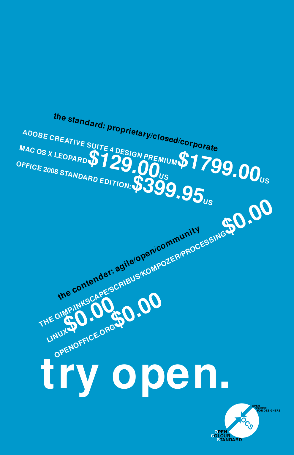
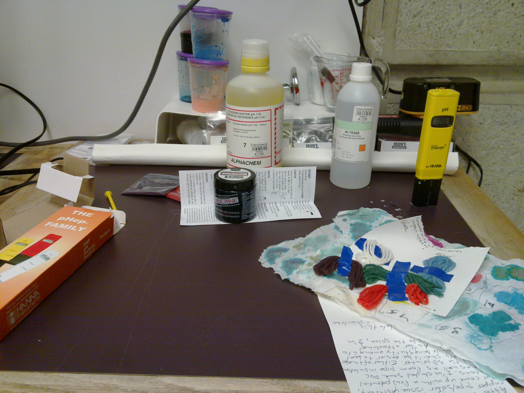
However, in the spirit of dispersing some of the apparent vapourousness, I'm going to share some pictures of what's happening right now, in my ad hoc laboratory. Since the big task right now is coming up with a good foundational set of colours for a couple of different applications, I've been focusing on acid dye (for animal protein-based textiles and some synthetics) and screen printing ink. Below, some of the tools involved in that development.

20110105_006.jpg


labimplements.png
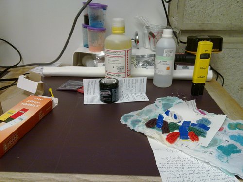
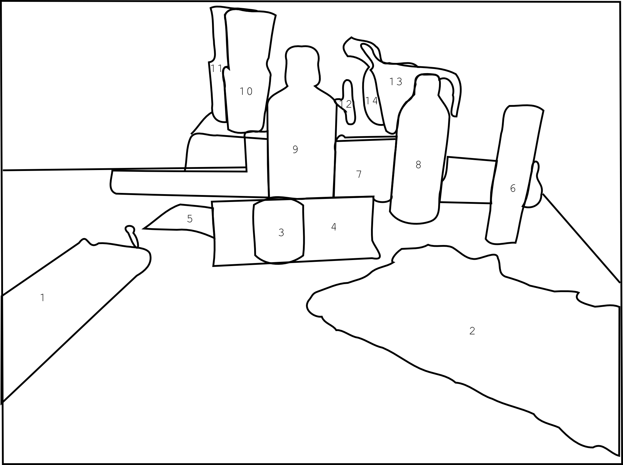
1. Box for pH meter, which stresses the ISO 9001 compliance of the company which manufactures the meter; 2. Test swatches of dye on both paper and wool; 3. Commercial, semi-permanent hair dye (for use as a pH comparison for successful cold dying of animal proteins); 4. Instructions for calibration and maintenance of pH meter; 5. Packets of FD&C dye powder (purchased from hobbyist soap making company); 6. pH meter (from scientific supply store); 7. Rack of FD&C dye packets; 8. Storage solution for pH meter; 9. Buffer solution for pH meter; 10. Tester inks made of FD&C dye solution (solution, combined with clear extender base for screen printing); 11. FD&C dye solution; 12. Thermometer (actually intended for cooking); 13. Spatulas, droppers and Pyrex measuring cup; 14. Jar of citric acid crystals, wrapped in plastic bag (purchased from textile dye supply store).

Back in the saddle

| No Comments | No TrackBacks
After much silence, I'm back and working full-tilt on Open Colour. At this point, the focus is on ink, as well as the theory and practice behind standards setting. So here's a very nice video of how ink is made.


Colour for everything, especially wool

| No Comments | No TrackBacks
There absolutely needs to be an open standard for print colour. I'm behind that and I'm working on it. But I'm increasingly of the opinion that there's more to it than print and screen. There's a world of physical things that depend on some sort of colour specification, whether loosely defined and changeable or rigid and consistent. On that first count, the loose and changeable, I've gotten to thinking about yarn and other animal proteins like silk and even human hair.

Anyone who knits knows well the pain of not buying quite enough yarn to finish a project, going back to the store, and finding that the yarn you've been working with, while still called by the same name, is a slightly different colour than before. Eventually, you learn to buy more yarn than you think you'll need, just for the sake of consistency. That's the problem with dye lots. Every batch of yarn, while using the same dye and same general process, comes out slightly different.

I'm not proposing to necessarily solve the dye lot problem. I have a hunch that a large part of it comes down to white and the inconsistency of the base colour of wool. But it has gotten me thinking. Wool is an interesting test case. It's easy enough to deal with, it has good possibilities for home brew colour experimentation and, most importantly, there's the dye. Wool, being an animal protein, can be coloured with acid dye. Or, to you and me, food colouring.

The food colouring angle is a good one. One of the biggest challenges of thinking about a spot colour system is sorting out the physical colour. It's been a hurdle in my exploration of colour for print. How, the thought goes, do you decide what the gamut of inks going into the spot colours will be? Are those colours consistent across ink manufacturers? And so on. This is the appeal of acid dye. In North America, at least, there's a handy gamut all ready to go. It's the set of dyes prefaced with the letters FD&C; (food, drug and cosmetic) or D&C; (drug and cosmetic). That's a limited gamut of dyes already carefully regulated by a government body. It takes away the gamut decision and just leaves questions of application and method guidelines/best practices, as well as the development of physical colours from those dyes and the translation of those colours into digital.

In short, expect some proof-of-concept wool and hair dye experiments from me in the near future.
The following gives background and advances an untried method for developing a colour matching system. It hasn't been tried yet, but I'm working on it.

The basic facts: Colour matching systems exist to standardize colour across the different parts of pre-press workflow. The dominant player, Pantone, uses ten different inks to create its spot colours. In addition to spot colour, Pantone employs its own augmented version of CMYK: Hexachrome, or CMYKOG. Hexachrome is supposed to be able to replicate more of the Pantone spot colour gamut than traditional CMYK can.

To roll your own spot colour standard, you'll need:
  • a light spectrometer (build, buy or borrow)
  • samples of ink from various manufacturers
  • samples of basic, elemental pigment
  • a precise scale
  • time
  • various types of paper
First, analyse your ink selection. which colours do the various manufacturers have in common, aside from CMYK? Once you've found a range of widely available colours, it's time to break out the spectrometer. Make some consistent colour swatches. That is to say, lay in a supply of a few types of paper. Take one of your available colours (you'll want to make sure you have a sample of that colour as produced by different manufacturers). Applying your ink evenly, create a swatch of that colour for each manufacturer. You should have several different swatches of the same colour, a few for each different brand of ink (more or less, depending on the number of papers you're testing with).

Next, grab your spectrometer. Use it to measure the different inks, comparing readings across brands. If two inks have the same readings on one type of paper, go on to the next type of paper and make sure they still match. If you get an exact match on all types of paper, score! Now see if any of the other inks match the spectrum. From each colour group, you should get data about which brands match each other exactly. Be sure to note the details. In an ideal world, it should be possible to find a grouping of different ink manufacturers who make matching products (although who knows what the success rate will be in reality). If they match across the spectrum of common colours, you've got yourself a palette.

You can use this palette as a jumping off point for your own colour mixing experiments. You'll eventually want to narrow down the number of different inks. Pantone, as mentioned above, uses ten. With a base selection of inks, consistent across several manufacturers, you can create your own custom palette of spot colours.

OCS poster, wiki

| No Comments | No TrackBacks
It just occurred to me that I never actually put up the final, fixed version of the OCS poster. So, ta dah!

Also worth mentioning is the OCS presence on the Create wiki. It comes with a flashy new domain name for OCS: opencolour.org. Eventually, I want to get a more permanent site up at that address, but for now, it's pointing to the wiki, where the future of Open Colour is being discussed.

Describing Colour

| No Comments | No TrackBacks
Bob Coons has put up a very nice synopsis on the basics of colour perception. Very readable, very understandable. Link

OCS Research Report V1.0.1

| 1 Comment | No TrackBacks
Version 1.0.1 of the OCS Research Report is now available. Download the pdf.

Revisions in v1.0.1:

Added:
p1. contributor list
p6. "The reverse of this is, of course, also true."
p6. "(including #0099cc, the colour of the OCS logo)"
p7. "As mentioned above, Pantone provides mixing instructions to print professionals. These instructions provide the direction necessary to create any colour in the Pantone range from a set of base colours (these colours include process yellow, process magenta, process cyan, process black, orange, red, blue, yellow, warm red, rubine red, rhodamine red, purple, violet, reflex blue, process blue and black). These instructions are laid out in a similar fashion to paint mixing ratios."
pp7-8. "despite the existence of other viable palettes such as Focoltone, Trumatech, Munsell (the rights to which are currently owned by X-Rite, Pantone's parent company), Toyo, HKS, RAL and so on."
p9. "(a Canadian chain of book stores)"
p13. "is" between the words "involvement" and "what" in paragraph 3
p15. a space between "students," and "use"
p15. "Usability: Even if they wish to try Open Source alternatives, many designers lack the skills required to do so. They may find programs difficult to install, with technical issues they aren't used to dealing with."

Modified:
Formatting changed to minimize excess white space at the tops of some pages.

Removed:
p11. " and the principles behind it" from after "(FLOSS)"

OCS Research Report Versioning Guidelines

| No Comments | No TrackBacks
The OCS Research Report is not going to be a static document. Revisions and suggestions are always welcome. (If you have anything that you think needs to be added, email me.) As such, we need a versioning system. Partly so that I won't forget and partly so that it's more widely known, here's the plan: I don't anticipate leaving the 1.somethings any time soon, if ever. So, the syntax will be 1.section added.section revised. In practice, this means that the newest version (coming soon), with changes to the section on colour spaces, will be version 1.0.1. Good?

New Site

| No Comments | No TrackBacks
Up and running, at a temporary address, the main OCS website. It's a little bare bones at the moment, but should be getting more content in the near future.

OCS site

OCS Open Source poster round two

| No Comments | No TrackBacks